Dear Alice| How To Choose The Right Paint Color
/In this week’s episode of Dear Alice, we’re talking about paint color! Paint is the most inexpensive and most impactful way to transform a space. We chat everything from white vs cream colors to some classic do’s and don’ts! You can listen to this podcast episode on Apple Podcast, Spotify, or Google Podcast.
beaujolais by Benjamin Moore
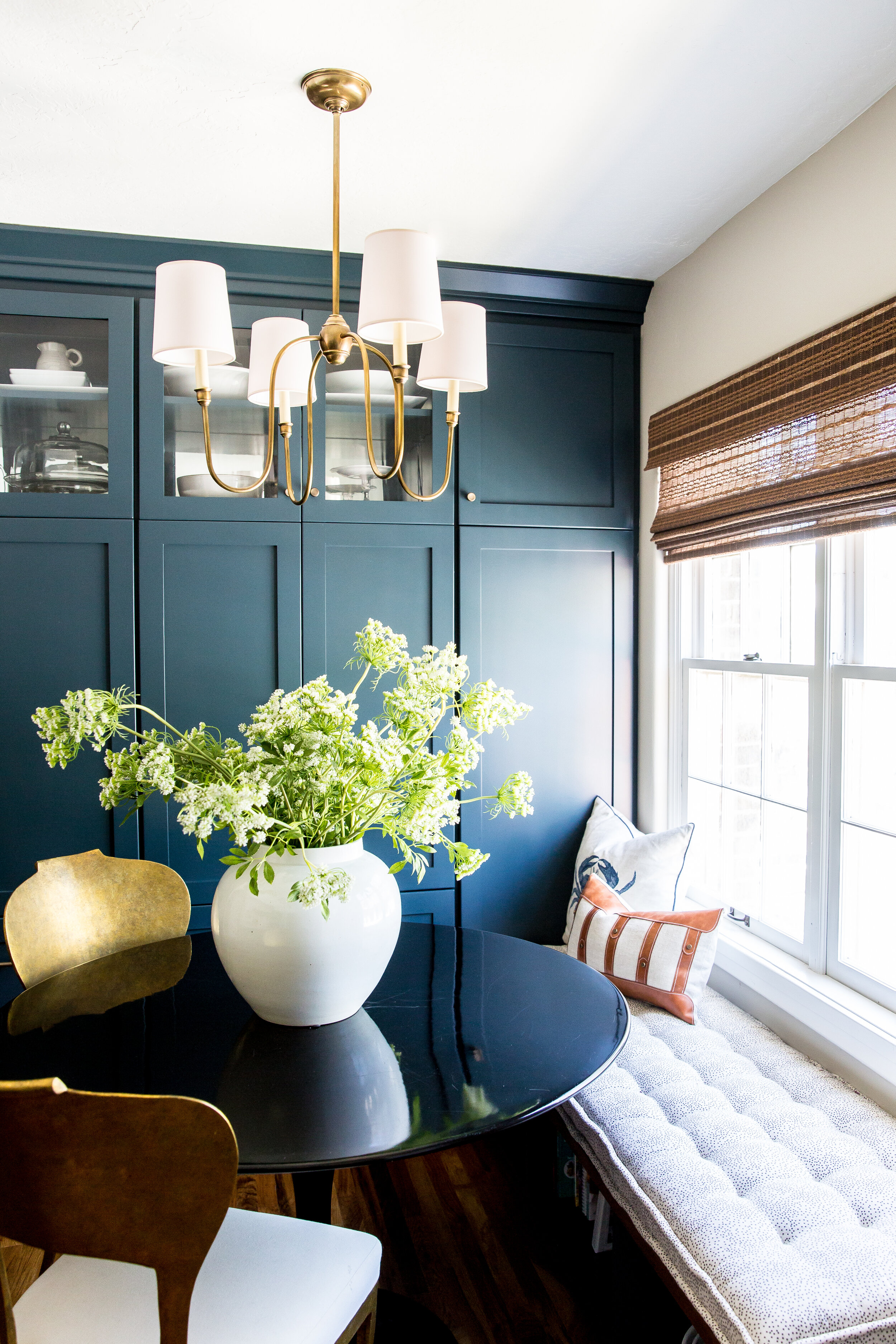
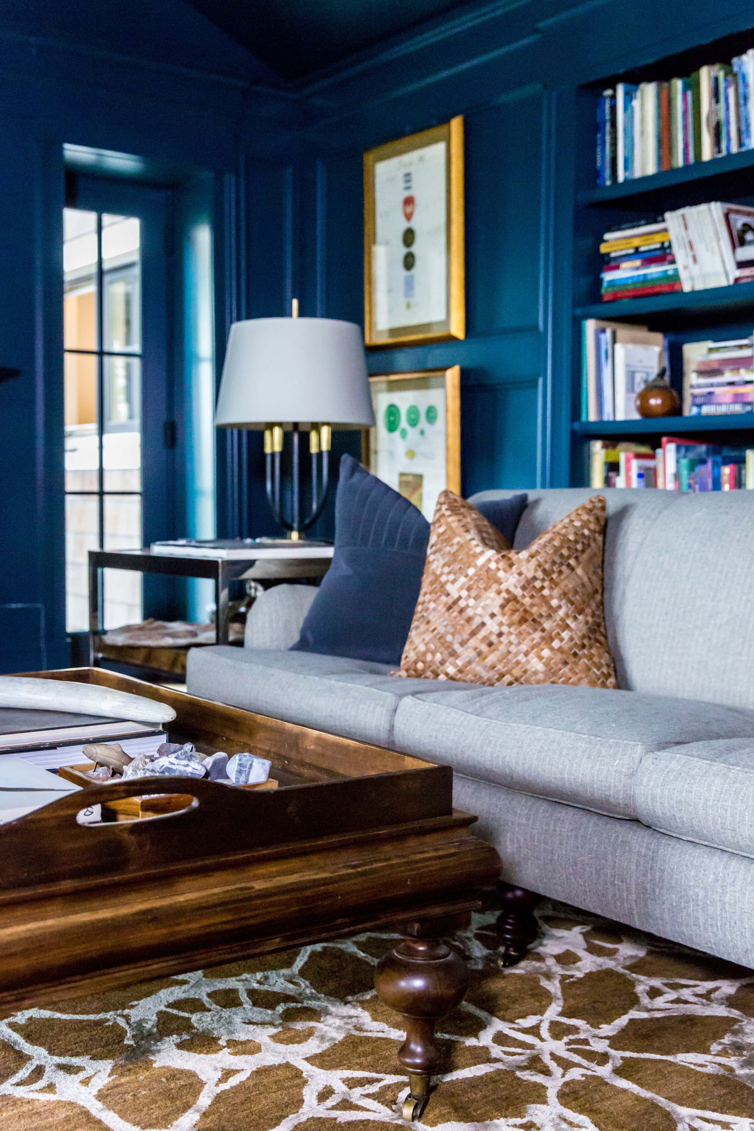
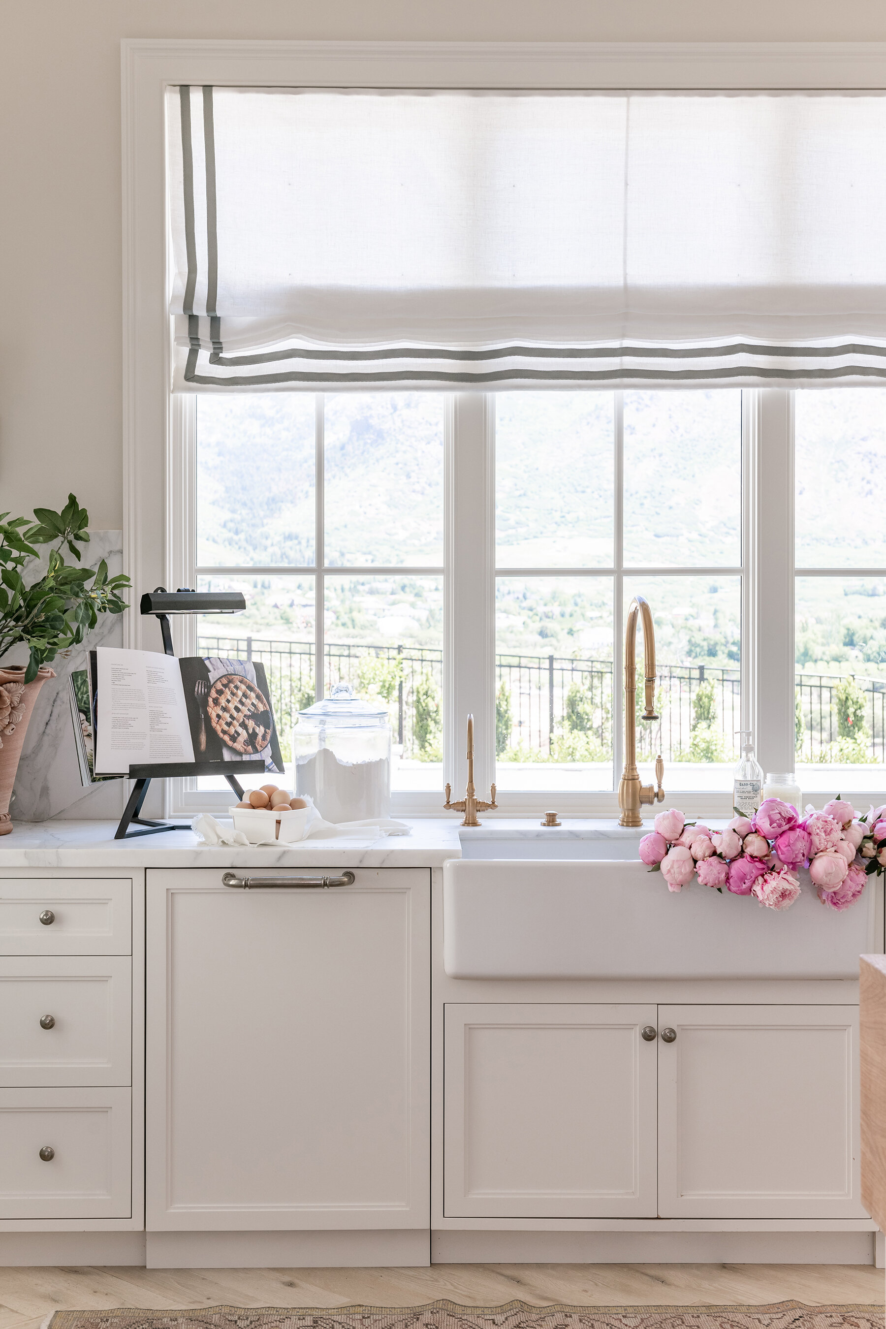
This might be surprising but we pick the paint color very last when designing a room! Once you have your furniture and rug picked out, it will be easier to find the right color that will complement your furnishings. It’s helpful to remember though that neutrals aren’t one size fits all and that while you may think you want a white painted room, you actually need a soft eggshell or cream. A bone-white compared to a clinical white can make a space feel more luxurious. In general, a paint color that looks great in someone’s kitchen, might not be the right shade for yours. Much like the idea that you wouldn’t try someone else’s foundation shade just because it looks good on them. The direction or lighting in a space, the furniture inside a space, and even the location of your home can change how a paint color looks. So it’s also important to test drive those samples (directly painting the walls is ideal) on multiple places where lighting is different to be sure you love the look before committing.
Don’t ask your neighbor what they think of the color because we all react to color differently- just make sure you like it! But if you need a little guidance, we like warmer tones because we find they are more flattering to our faces. Did you know that it is possible to have a warm-toned cool color by being blue-based? It’s something to think about when picking out those traditionally cool-toned colors like blues, greens, and purples.
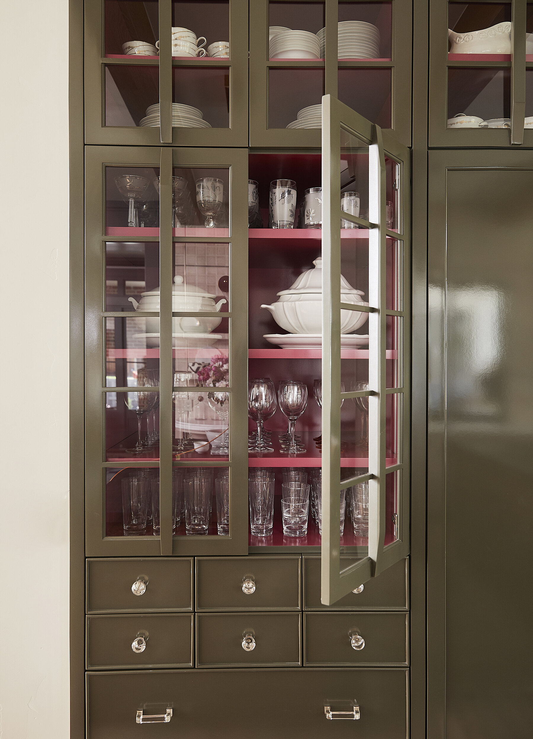
Historical Colors from Benjamin Moore are pretty safe because they are tried and true. They’ve been classic colors to turn to throughout time which is why it’s perfect for the people who are wanting a classically elevated color. Sherwin Williams does bright colors really well, so, if you’re ready to have some fun, they are the way to go! If a European aesthetic speaks to your soul- Farrow and Ball is for you. They run a bit pricer compared to most other paints on the market but they are a wonderful investment nonetheless. As a great pro-tip; most paint has about a 99% match rate so get a small sample can of the paint you use so when life happens you can touch it up!
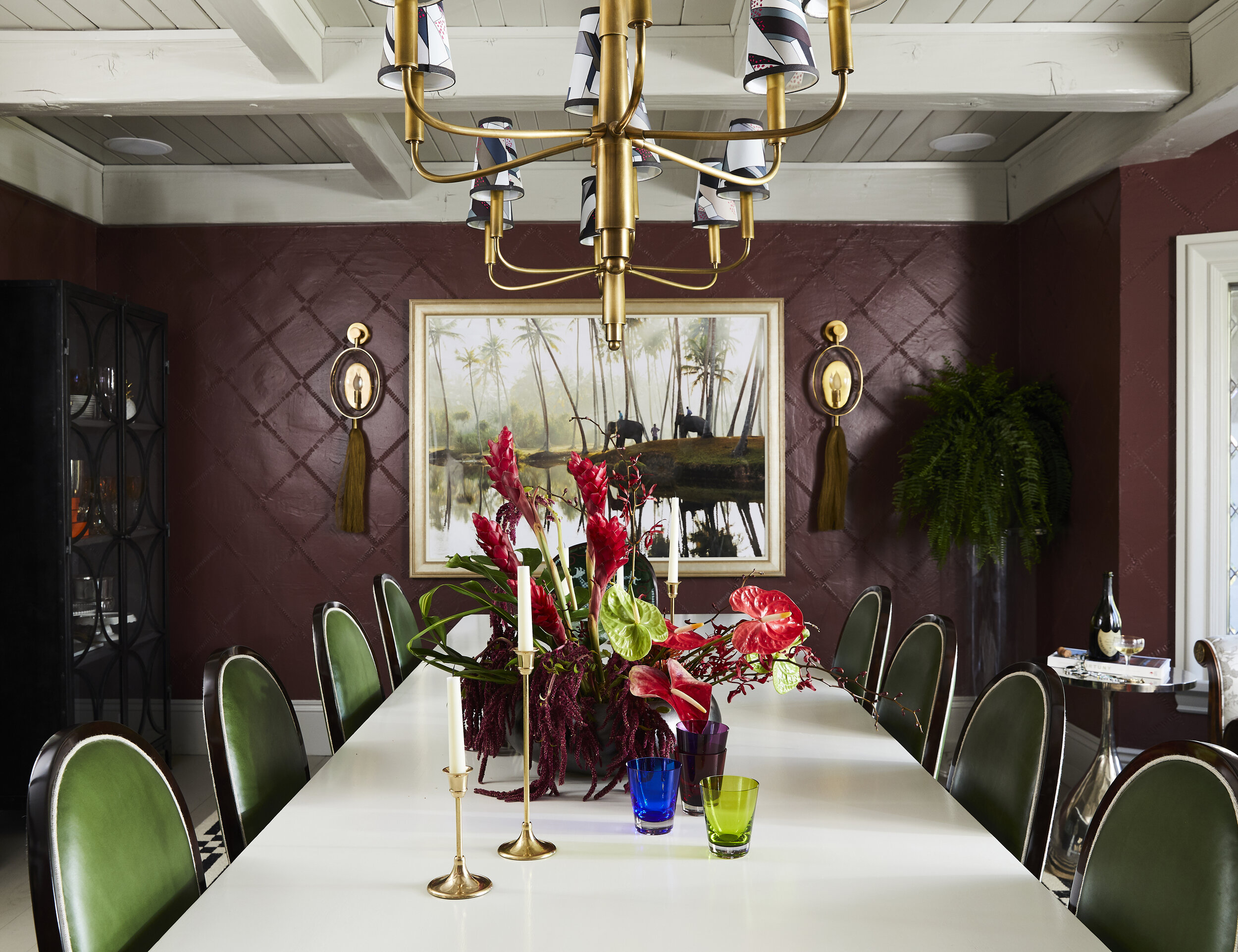
Your ceiling is the 5th wall- don’t neglect it! Your ceiling should be addressed so you’re not cocooned in with just your walls. A ceiling is a point of contrast that feels a lot easier with a continuation of the beautiful color story. A trick we like to do with the ceiling: if your room is a fun color, paint the ceiling a lighter tone of the wall color. Make sure to change up the finish: we (almost) always do satin finish on the walls, eggshell finish on the ceiling, and semi-gloss for the trim work.
The powder bathroom is a great chance to use fun wallpaper or bold color because you don’t spend that much time in there. This is the space where you can go all out! And when we say all out, we mean every wall. If you’ve been around long enough, you probably already know we aren’t big fans of accent walls. Just commit to painting your whole room because they just look like you ran out of paint. The contrast from where the accent wall meets the white or neutral wall gives off so much tension and your eyes will go to those lines first thing.
Thank you for reading about all of our paint and color opinions! Any questions or podcast ideas? Email us at dearalice@alicelanehome.com