
How to do Big Design in a Small Space
/If you’ve been following us on Instagram, you may have already seen some teasers of this luxury remodel we’ve designed for our client, Ashlee Kennedy (and if you’re not following us on IG you should be ;) @alicelanehome & @alicelaneinteriors). Lucky for us, Ashlee has impeccable taste and is a lover of the Frank Sinatra era, 80s rock-n-roll and designer, Kelly Wearstler. Packing all this style into a small old home was a challenge we were excited to accept.
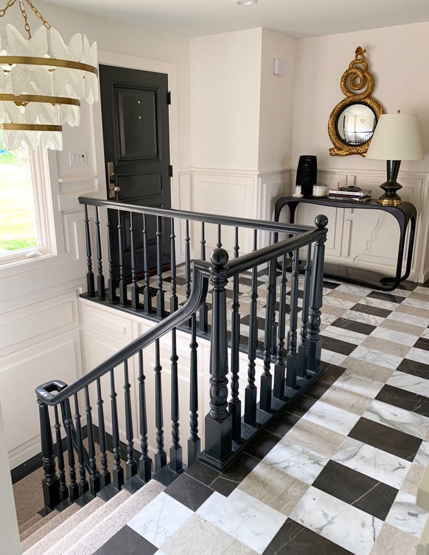
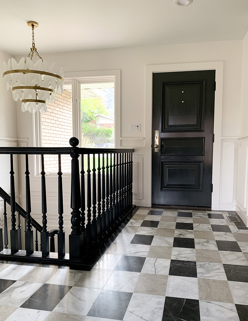
This home was built in 1986, with that came low 8-foot ceilings and small rooms. In the entry, we used one of our favorite space expanding tricks. This busy tile pattern, made up of three different stones, confuses the eye making the room feel larger than it is. We are so happy we were able to hang a chandelier in this space—even with the low ceilings. Instead of the typical placement, we hung it above the staircase which allowed more breathing room and adds that extra bit of interest. Painting the existing banister was not only a huge cost savings trick but also added just the right amount of contrast with the white custom finish work on the walls. This dimensional “wedding cake style” finish work is definitely the cherry on top of this high fashion entryway.
Learn more tricks we used in this space on part 1 of our 3 part series here
The next room we tackled was the master bathroom and closet The first trick in this master bathroom that makes it feel gracious and gives it big design, is the 12” backsplash rather than the typical 4” backsplash. The height of it helps elongate the walls and the dark veins in the marble make it feel super high end. To get a master bath of this size in a 1986 home, we had to steal space from the closet that was along the back wall. We then stole from an extra guest room to make a walk-in master closet.
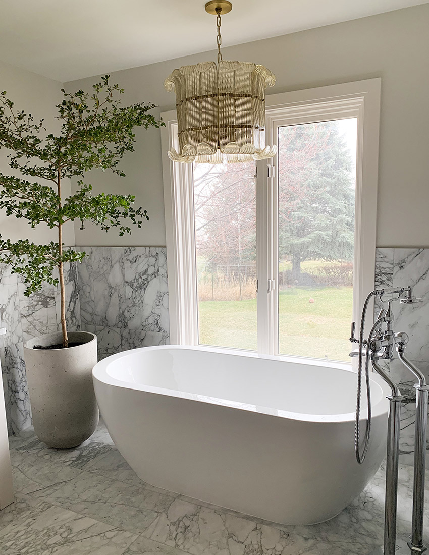
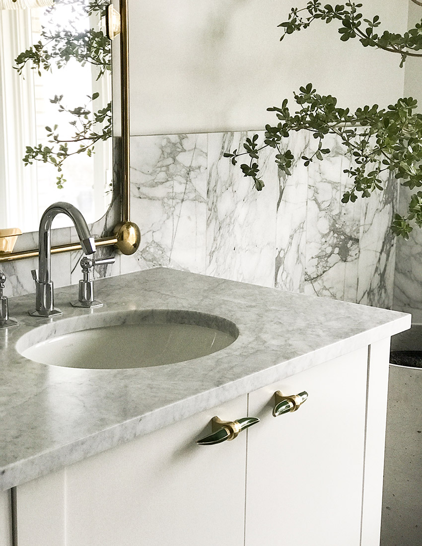

Hanging the chandelier over the bathtub was another space expanding trick. Again, with 8-foot ceilings this was really the only option for this gorgeous lighting, but we love how it looks. Some of our other favorites parts of this bathroom include the bold Kelly Wearstler wallpaper that we used in the potty closet. It adds such a fun pop to this space. We also love the mix of metals. Mixing metals is such a smart trick—it makes a room feel more timeless. Our top tip for mixing metals: keep the faucets and “working” plumbing traditional (polished nickel or chrome), then use brass for the jewelry pieces of the room—mirrors, lighting and hardware.
Watch part 2 of our 3 part series here
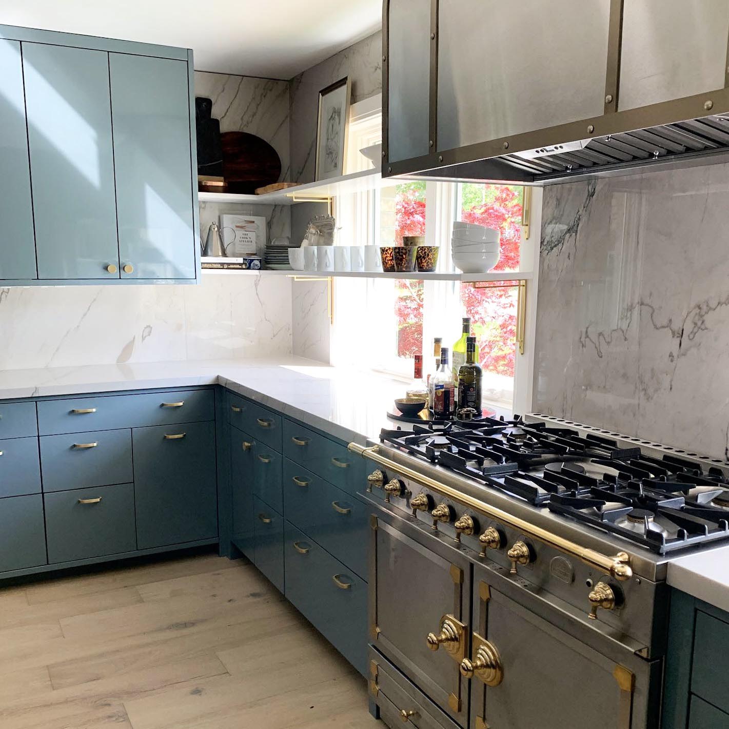
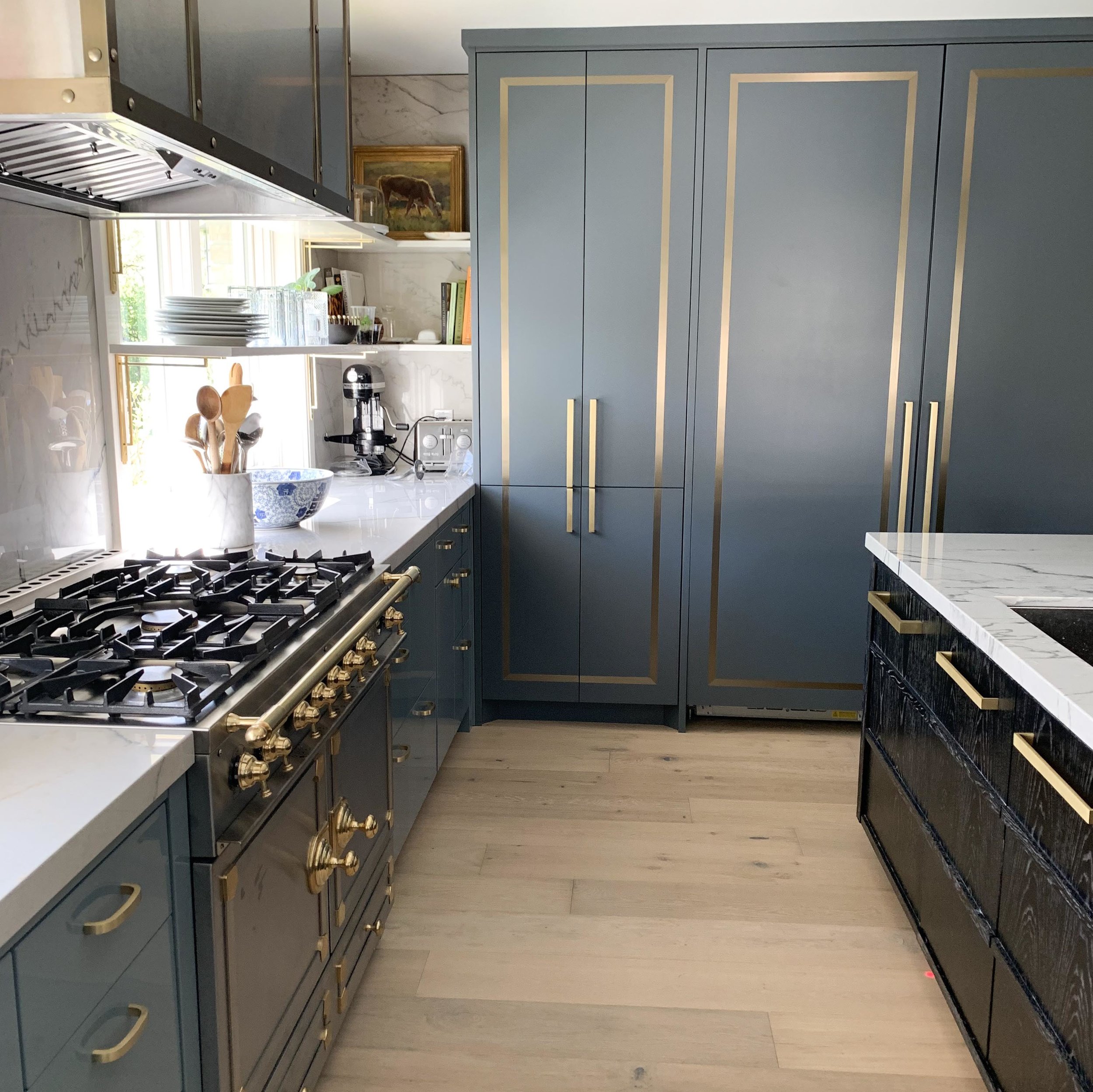
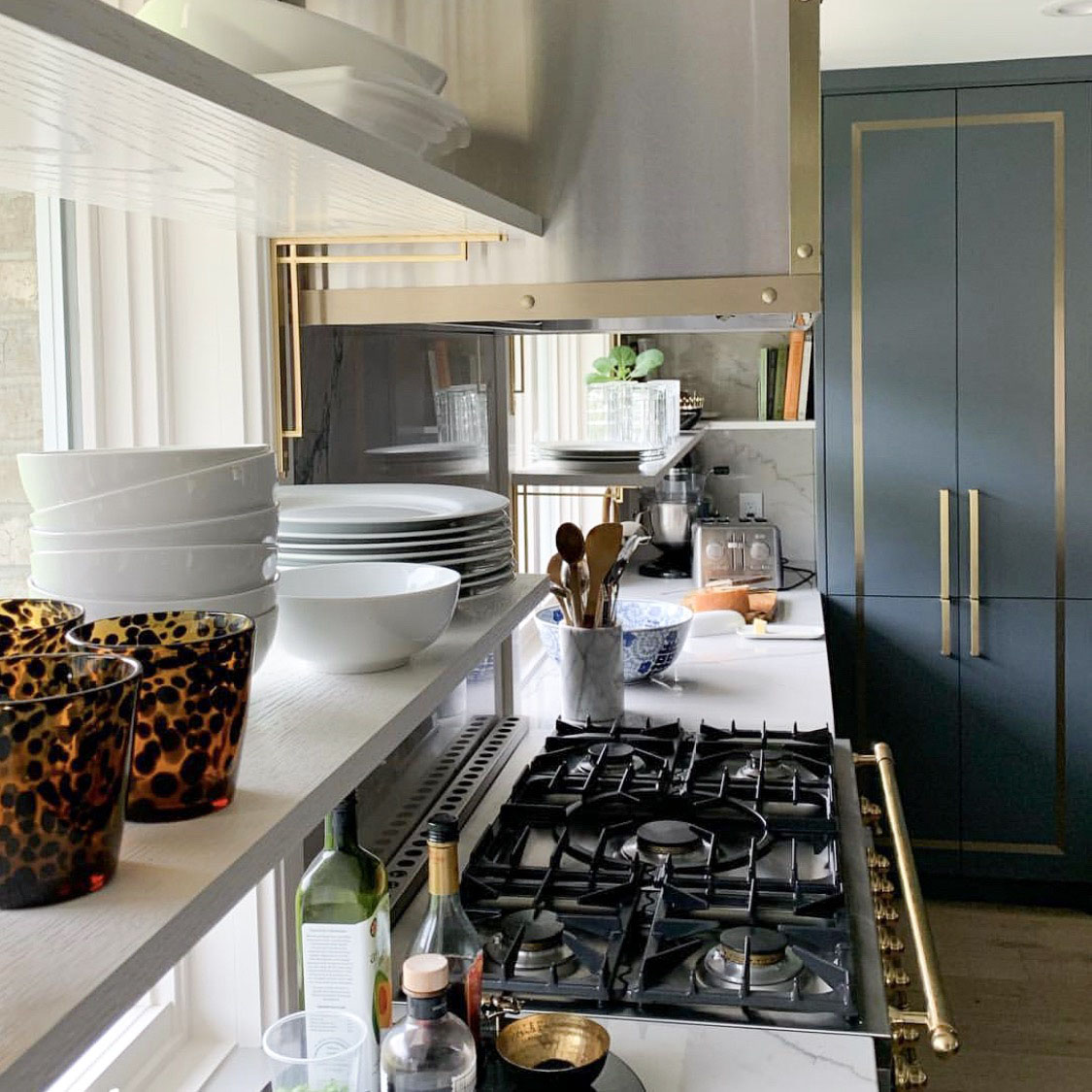
The kitchen is probably our favorite space out of the bunch! It was originally inspired by a Steven Gambrel room featuring lacquered walls. To get this look for less, we had the cabinetry made in a metal rather than traditional wood and finished with a high gloss paint. The fridge wall is fun and very atypical—the cabinetry is not only a different finish but also a different material. It gives this space a real custom feel. The best space expanding trick you can do in a kitchen is to take the cabinetry to the ceiling. It adds more storage space while tricking your eye, making the walls feel taller. Again, we’re mixing metals in this space starting with this showpiece hood, allowing you to continue to mix metals throughout. Our proudest design aspect in this kitchen is the rhythm in the cabinetry layout—we’ve never done anything like it before. It looks almost haphazard which gives this kitchen a real designer look.

See more of the kitchen on part 3 of our 3 part series
Thank you so much to our client, Ashlee Kennedy, for not only trusting our designs but having the best taste!
See more on our hashtag: #houseofkennedyxalicelane